Detecting Talos regressions


This post is about modelling Talos data with a probabilistic model which can be applied to different use-cases, like detecting regressions and/or improvements over time.

Talos is Mozilla’s multiplatform performance testing framework written in python that we use to run and collect statistics of different performance tests after a push.

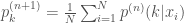
As a concrete example, this is how the performance data of a test might look like over time:

noisy

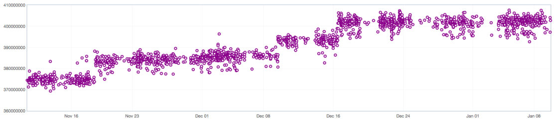
Even though there is some noise, which is exacerbated in this graph as the vertical axis doesn’t start from 0, we clearly see a shift of the distribution over time. We would like to detect such shifts as soon as possible after they happened.

Talos data has been known for a while to generate in some cases bi-modal data points that can break our current alerting engine.

bimodal

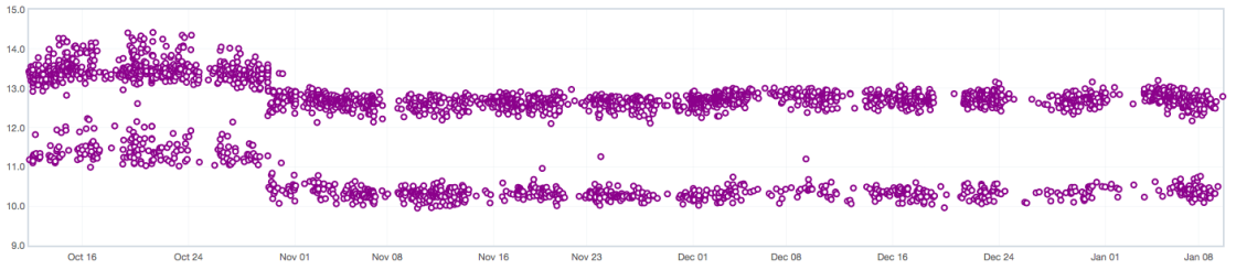
Possible reasons for bi-modality are documented in Bug 908888. As past efforts to remove the bi-modal behavior at the source have failed we have to deal with it in our model.

The following are some notes originated from conversations with Joel, Kyle, Mauro and Saptarshi.

Mixture of Gaussians

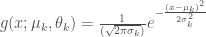
The data can be modelled as a mixture of K Gaussians, where the parameter K could be determined by fitting K models and selecting the best one according to some criteria.

The first obstacle is to estimate the parameters of the mixture from a set of data points. Let’s state this problem formally; if you are not interested in the mathematical derivation it suffices to know that scikit-learn has an efficient implementation of it.

EM Algorithm

We want to find the probability density f(x) , where f is a mixture of K Gaussians, that is most likely to have generated a given data point x :

f(x; \theta) = \sum_{k=1}^{K} p_k g(x; \mu_k, \sigma_k)

where p_k is the mixing coefficient of cluster K , i.e. the probability that a generic point belongs to cluster K so that \sum_{k=1}^{K}p_k = 1 , and g is the probability density function of the normal distribution:

g(x; \mu_k, \theta_k) = \frac{1}{(\sqrt{2\pi\sigma_k})}e^{-\frac{(x - \mu_k)^2}{2\sigma_k^2}}

Now, given a set of N data points that are independent and identically distributed, we would like to determine the values of p_k , \mu_k and \sigma_k that maximize the log-likelihood function. Finding the maximum of a function often involves taking the derivative of a function and solving for the parameter being maximized, and this is often easier when the function being maximized is a log-likelihood rather than the original likelihood function.

\log\mathcal{L}(\theta | x_1, ..., n_n) = \log\prod_{i=1}^{N} f(x_i; \theta)

To find a maximum of  \mathcal{L} , let’s compute the partial derivative of it wrt \mu_k , \sigma_k and p_k . Since

\frac{\partial{g(x_i; \mu_k, \theta_k)}}{\partial{\mu_k}} = g(x_i; \mu_k, \theta_k) \frac{\partial}{\partial{\mu_k}} [-\frac{(x_i - \mu_k)^2}{2\sigma_k^2}] = \frac{g(x_i; \mu_k, \theta_k) (x_i - \mu_k)}{\sigma_k^2}

then

\frac{\partial\log\mathcal{L}}{\partial{\mu_k}} = \sum_{i=1}^{N}\frac{1}{\sigma_k^2}\frac{p_kg(x_i; \mu_k, \sigma_k)}{\sum_{j=1}^{N}p_jg(x_i; \mu_j, \sigma_j)}(x_i - \mu_k)

But, by Bayes’ Theorem, \frac{p_kg(x_i; \mu_k, \sigma_k)}{\sum_{j=1}^{N}p_jg(x_i; \mu_j, \sigma_j)} is the conditional probability of selecting cluster k given that the data point x_i was observed, i.e. p(k|x_i) , so that:

\frac{\log\partial\mathcal{L}}{\partial{\mu_k}} = \sum_{i=1}^{N}\frac{p(k|x_i)}{\sigma_k^2}(x_i - \mu_k)

By applying a similar procedure to compute the partial derivative with respect to \sigma_k and p_k and finally setting the derivatives we just found to zero, we obtain:

\mu_k = \frac{\sum_{i=1}^{N}p(k|x_i)x_i}{\sum_{i=1}^{N}p(k|x_i)}

\sigma_k = \sqrt{\frac{\sum_{i=1}^{N}p(k|x_i)(x_i - \mu_k)^2}{\sum_{n=1}^{N}p(k|x_i)}}

p_k = \frac{1}{N}\sum_{i=1}^{N}p(k|x_i)

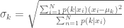
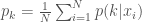
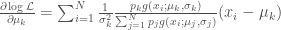
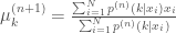
The first two equations turn out to be simply the sample mean and standard deviation of the data weighted by the conditional probability that component k generated the data point x_i .

Since the terms p(k|x_i) depend on all the terms on the left-hand side of the expressions above, the equations are hard to solve directly and this is where the EM algorithm comes to rescue. It can be proven that the EM algorithm convergences to a local maximum of the likelihood function when the following computations are iterated:

E Step

p^{(n)}(k|x_i) = \frac{p_k^{(n)}g(x_i; \mu_k^{(n)}, \sigma_k^{(n)})}{\sum_{j=1}^{N}p_jg(x_i; \mu_j^{(n)}, \sigma_j^{(n)})}

M Step

\mu_k^{(n+1)} = \frac{\sum_{i=1}^{N}p^{(n)}(k|x_i)x_i}{\sum_{i=1}^{N}p^{(n)}(k|x_i)}

\sigma_k^{(n+1)} = \sqrt{\frac{\sum_{i=1}^{N}p^{(n)}(k|x_i)(x_i - \mu^{(n+1)})^2}{\sum_{n=1}^{N}p^{(n)}(k|x_i)}}

p_k^{(n+1)} = \frac{1}{N}\sum_{i=1}^{N}p^{(n)}(k|x_i)

Intuitively, in the E-step the parameters of the components are assumed to be given and the data points are soft-assigned to the clusters. In the M-step we compute the updated parameters for our clusters given the new assignment.

Determine K

Now that we have a way to fit a mixture of K gaussians to our data, how do we determine K ? One way to deal with it is to generate K models and select the best one according to their BIC score. Adding more components to a model will fit the data better but doing so may result in overfitting. BIC prevents this problem by introducing a penalty term for the number of parameters in the model.

Regression Detection

A simple approach to detect changes in the series is to use a rolling window and compare the distribution of the first half of the window to the distribution of the second half. Since we are dealing with Gaussians, we can use the z-statistic to compare the mean of each component in the left window to mean of its corresponding component in the right window:

z = \frac{\mu_l - \mu_r}{\sqrt{\frac{\sigma_l^2}{n_l} + \frac{\sigma_r^2}{n_r}}}

In the following plots the red dots are points at which the regression detection would have fired. Ideally the system would generate a single alert per cluster for the first point after the distribution shift.

regression1

regression2

regression3

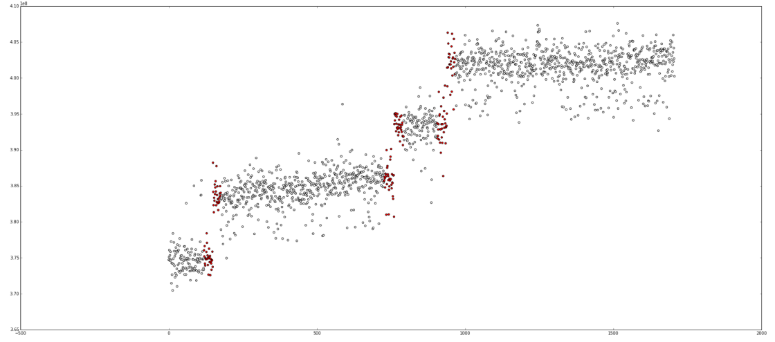
Talos generates hundreds of different time series, some with dominating and peculiar noise patterns. As such it’s hard to come up with a generic model that solves the problem for good and represents the data perfectly.

Since the API to access this data is public, it provides an exciting opportunity for a contributor to come up with better ways of representing it. Feel free to join us on #perf if you are interested. Oh and, did I mentions we are hiring a Senior Data Engineer?

Telemetry meets Parquet

In Mozilla’s Telemetry land, raw JSON pings are stored on S3 within files containing framed Heka records, which form our immutable, append-only master dataset. Reading the raw data with Spark can be slow for analyses that read only a handful of fields per record from the thousands available; not to mention the cost of parsing the JSON blobs in the first place.

We are slowly moving away from JSON to a more OLAP-friendly serialization format for the master dataset, which requires defining a proper schema. Given that we have been collecting data in big JSON payloads since the beginning of time, different subsystems have been using various, in some cases schema un-friendly, data layouts. That and the fact that we have thousands of fields embedded in a complex nested structure makes it hard to retrospectively enforce a schema that matches our current data, so a change is likely not going to happen overnight.

Until recently the only way to process Telemetry data with Spark was to read the raw data directly, which isn’t efficient but gets the job done.

Batch views

Some analyses require filtering out a considerable amount of data before the actual workload can start. To improve the efficiency of such jobs, we started defining derived streams, or so called pre-computed batch views in lambda’s architecture lingo.

A batch view is regenerated or updated daily and, in a mathematical sense, it’s simply a function over the entire master dataset. The view usually contains a subset of the master dataset, possibly transformed, with the objective to make analyses that depend on it more efficient.

batch_view

As a concrete example, we have run an A/B test on Aurora 43 in which we disabled or enabled Electrolysis (E10s) based on a coin flip (note that E10s is enabled by default on Aurora). In this particular experiment we were aiming to study the performance of E10s. The experiment had a lifespan of one week per user. As some of our users access Firefox sporadically, we couldn’t just sample a few days worth of data and be done with it as ignoring the long tail of submissions would have biased our results.

We clearly needed a batch view of our master dataset that contained only submissions for users that were currently enrolled in the experiment, in order to avoid an expensive filtering step.

Parquet

We decided to serialize the data for our batch views back to S3 as Parquet files. Parquet is a columnar file storage that is slowly becoming the lingua franca of Hadoop’s ecosystem as it can be read and written from e.g. Hive, Pig & Spark.

Conceptually it’s important to clarify that Parquet is just a storage format, i.e. a binary representation of the data, and it relies on object models, like the one provided by Avro or Thrift, to represent the data in memory. A set of object model converters are provided to map between the in-memory representation and the storage format.

Parquet supports efficient compression and encoding schemes, which are applied on a per-column level where the data tends to be homogeneous. Furthermore, as Spark can load parquet files in a Dataframe, a Python analysis can potentially experience the same performance as a Scala one thanks to a unified physical execution layer.

A Parquet file is composed of:

  • row groups, which contain a subset of rows – a row group is composed of a set of column chunks;
  • column chunks, which contain values for a specific column – a column chunk is partitioned in a set of pages;
  • pages, which are the smallest level of granularity for reads – compression and encoding are applied at this level of abstraction
  • a footer, which contains the schema and some other metadata.

parquet

As batch views typically use only a subset of the fields provided in our Telemetry payloads, the problem of defining a schema for such subset becomes a non-issue.

Benefits

Unsurpsingly, we have seen speed-ups of up to a couple of orders of magnitude in some analyses and a reduction of file size by up to 8x compared to files having the same compression scheme and content (no JSON, just framed Heka records).

Each view is generated with a Spark job. In the future Heka is likely going to produce the views directly, once it supports Parquet natively.

Next-gen Data Analysis Framework for Telemetry

The easier it is to get answers, the more questions will be asked

In that spirit me and Mark Reid have been working for a while now on a new analysis infrastracture to make it as easy as possible for engineers to get answers to data related questions.

Our shiny new analysis infrastructure is based primarily on IPython and Spark. I blogged about Spark before, I even gave a short tutorial on it at our last workweek in Portland (slides and tutorial); IPython might be something you are not familiar with unless you have a background in science. In a nutshell it’s a browser-based notebook with support for code, text, mathematical expressions, inline plots and other rich media.

IPython
An IPython notebook in all its glory

The combination of IPython and Spark allows to write data analyses interactively from a browser and seemingly parallelize them over multiple machines thanks to a rich API with over 80 distributed operators! It’s a huge leap forward in terms of productivity compared to traditional batch oriented map-reduce frameworks. An IPython notebook contains both the code and the product of the execution of that code, like plots. Once executed, a notebook can simply be serialized and uploaded to Github. Then, thanks to nbviewer, it can be visualized and shared among colleagues.

In fact, the issue with sharing just the end product of an analysis is that it’s all too easy for bugs to creep in or to make wrong assumptions. If your end result is a plot, how do you test it? How do you know that what you are looking at does actually reflect the truth? Having the code side by side with its evaluation allows more people to  inspect it and streamlines the review process.

This is what you need to do to start your IPython backed Spark cluster with access to Telemetry data:

  1. Visit the analysis provisioning dashboard at telemetry-dash.mozilla.org and sign in using Persona with an @mozilla.com email address.
  2. Click “Launch an ad-hoc Spark cluster”.
  3. Enter some details:
    • The “Cluster Name” field should be a short descriptive name, like “chromehangs analysis”.
    • Set the number of workers for the cluster. Please keep in mind to use resources sparingly; use a single worker to write and debug your job.
    • Upload your SSH public key.
  4. Click “Submit”.
  5. A cluster will be launched on AWS preconfigured with Spark, IPython and some handy data analysis libraries like pandas and matplotlib.

Once the cluster is ready, you can tunnel IPython through SSH by following the instructions on the dashboard, e.g.:

ssh -i my-private-key -L 8888:localhost:8888 hadoop@ec2-54-70-129-221.us-west-2.compute.amazonaws.com

Finally, you can launch IPython in Firefox by visiting http://localhost:8888.

Now what? Glad you asked. In your notebook listing you will see a Hello World notebook. It’s a very simple analysis that produces the distribution of startup times faceted by operating system for a small fraction of Telemetry submissions; let’s quickly review it here.

We start by importing a telemetry utility to fetch pings and some commonly needed libraries for analysis: a json parser, pandas and matplotlib.

import ujson as json
import matplotlib.pyplot as plt
import pandas as pd
from moztelemetry.spark import get_pings

To execute a block of code in IPython, aka cell, press Shift-Enter. While a cell is being executed, a gray circle will appear in the upper right border of the notebook. When the circle is full, your code is being executed by the IPython kernel; when only the borders of the circle are visible then the kernel is idle and waiting for commands.

Spark exploits parallelism across all cores of your cluster. To see the degree of parallelism you have at your disposal simply yield:


sc.defaultParallelism

Now, let’s fetch a set of telemetry submissions and load it in a RDD using the get_pings utility function from the moztelemetry library:

pings = get_pings(sc,
                  appName="Firefox",
                  channel="nightly",
                  version="*",
                  buildid="*",
                  submission_date="20141208",
                  fraction=0.1)

That’s pretty much self documenting. The fraction parameter, which defaults to 1, selects a random subset of the selected submissions. This comes in handy when you first write your analysis and don’t need to load lots of data to test and debug it.

Note that both the buildid and submission_date parameters accept also a tuple specifying, inclusively, a range of dates, e.g.:


pings = get_pings(sc,
                  appName="Firefox",
                  channel="nightly",
                  version="*",
                  buildid=("20141201", "20141202"),
                  submission_date=("20141202", ""20141208"))

Let’s do something with those pings. Since we are interested in the distribution of the startup time of Firefox faceted by operating system, let’s extract the needed fields from our submissions:

def extract(ping):
    ping = json.loads(ping)
    os = ping["info"]["OS"]
    startup = ping["simpleMeasurements"].get("firstPaint", -1)
    return (os, startup)

cached = pings.map(lambda ping: extract(ping)).filter(lambda p: p[1] > 0).cache()

As the Python API matches closely the one used from Scala, I suggest to have a look at my older Spark tutorial if you are not familiar with Spark. Another good resource are the hands-on exercises from AMP Camp 4.

Now, let’s collect the results back and stuff it into a pandas DataFrame. This is a very common pattern, once you reduce your dataset to a manageable size with Spark you collect it back on your driver (aka the master machine) and finalize your analysis with statistical tests, plots and whatnot.

grouped = cached.groupByKey().collectAsMap()

frame = pd.DataFrame({x: log(pd.Series(list(y))) for x, y in grouped.items()})
frame.boxplot()
plt.ylabel("log(firstPaint)")
plt.show()

startup_hello
Startup distribution by OS

Finally, you can save the notebook, upload it to Github or Bugzilla and visualize it on nbviewer, it’s that simple. Here is the nbviewer powered Hello World notebook. I warmly suggest that you open a bug report on Bugzilla for your custom Telemetry analysis and ask me or Vladan Djeric to review it. Mozilla has been doing code reviews for years and with good reasons, why should data analyses be different?

Congrats, you just completed your first Spark analysis with IPython! If you need any help with your custom job feel free to drop me a line in #telemetry.

Dashboard generator for custom Telemetry jobs

So you wrote your custom analysis for Telemetry, your map-reduce job is finally giving you the desired data and you want to set it up so that it runs periodically. You will need some sort of dashboard to monitor the weekly runs but since you don’t really care how it’s done what do you do? You copy paste the code of one of our current dashboards, a little tweak here and there and off you go.

That basically describes all of the recent dashboards, like the one for main-thread IO (mea culpa). Writing dashboards is painful when the only thing you care about is data. Once you finally have what you were looking for, the way you present is often considered an afterthought at best. But maintaining N dashboards becomes quickly unpleasant.

But what makes writing and maintaining dashboards so painful exactly? It’s simply that the more controls you have, the more different kind events you have to handle and the easier things get out of hand quickly. You start with something small and beautiful that just displays some csv and presto you end up with what should have been properly described as a state machine but instead is a mess of intertwined event handlers.

What I was looking for was something on the line of Shiny for R, but in javascript and with the option to have a client-only based interface. It turns out that React does more or less what I want. It’s not necessary meant for data analysis so there aren’t any plotting facilities but everything is there to roll your own. What makes exactly Shiny and React so useful is that they embrace reactive programming. Once you define a state and a set of dependencies, i.e. a data flow graph in practical terms, changes that affect the state end up being automatically propagated to the right components. Even though this can be seen as overkill for small dashboards, it makes it extremely easy to extend them when the set of possible states expands, which is almost always what happens.

To make things easier for developers I wrote a dashboard generator, iacumus, for use-cases similar to the ones we currently have. It can be used in simple scenarios when:

  • the data is collected in csv files on a weekly basis, usually using build-ids;
  • the dashboard should compare the current week against the previous one and mark differences in rankings;
  • it should be possible to go back back and forward in time;
  • the dashboard should provide some filtering and sorting criterias.

Iacumus is customizable through a configuration file that is specified through a GET parameter. Since it’s hosted on github, it means you just have to provide the data and don’t even have to spend time deploying the dashboard somewhere, assuming the machine serving the configuration file supports CORS.

My next immediate goal is to simplify writing map-reduce jobs for the above mentioned use cases or to the very least write down some guidelines. For instance, some of our dashboards are based on Firefox’s version numbers and not on build-ids, which is really what you want when you desire to make comparisons of Nightly on a weekly basis.

Another interesting thought would be to automatically detect differences in the dashboards and send alerts. That might be not as easy with the current data, since a quick look at the dashboards makes it clear that the rankings fluctuate quite a bit. We would have to collect daily reports and account for the variance of the ranking in those as just using a few weekly datapoints is not reliable enough to account for the deviation.